|
|
Post by AntonyJC on Oct 2, 2008 17:34:59 GMT -5
|
|
|
|
Post by AntonyJC on Oct 2, 2008 17:40:39 GMT -5
|
|
|
|
Post by AntonyJC on Oct 3, 2008 14:19:14 GMT -5
 just made ... took about 45 mins |
|
|
|
Post by SForce on Oct 3, 2008 15:14:57 GMT -5
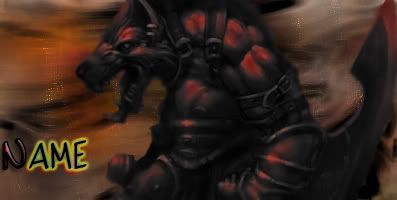
i like the wolf one, very nice
|
|
|
|
Post by AntonyJC on Oct 3, 2008 17:22:13 GMT -5
thank you. lol and you can take urs if you want
|
|
|
|
Post by dylan1431 on Oct 5, 2008 17:25:33 GMT -5
 just made ... took about 45 mins This picture if very cool. I like it. 45mins? Man, I wish I could make sigs at all let alot ones this good in 45mins. |
|
|
|
Post by AntonyJC on Oct 6, 2008 8:37:02 GMT -5
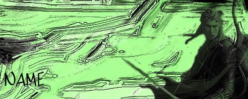
 new one took about an hour tell me if you want any of the new ones (wolf and elf) and i can edit the name and  |
|
|
|
Post by paco01 on Oct 6, 2008 15:09:44 GMT -5
just a few things... both sigs have pretty decent backgrounds BUT. the renders dont fit well. theyre not blending with the background. the flow between background and render isnt there. that and the text is horrid  . things that come with practice though. gettin better (: |
|
|
|
Post by AntonyJC on Oct 7, 2008 12:08:22 GMT -5
yeah those were quick and the text i didnt really worry about but for the backgrounds what do i do omg i cant figure it out  |
|
|
|
Post by AntonyJC on Oct 7, 2008 15:03:03 GMT -5
how do i make those renders match the backgrounds then paco huh?!?!?!
|
|
|
|
Post by paco01 on Oct 7, 2008 15:23:42 GMT -5
thats for u to find out. but if you look at it. doesnt the render seem sorta outta place... its not really a focus point and it just sits in a weird way. its gotta flow  |
|
|
|
Post by AntonyJC on Oct 7, 2008 15:46:03 GMT -5
so your sayin that i have to find a certin place within the sig or like make the render like pop out of the siggy?
JC
|
|
|
|
Post by AntonyJC on Oct 14, 2008 12:06:32 GMT -5
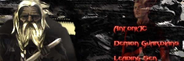
 newest for our new member |
|
|
|
Post by AntonyJC on Oct 20, 2008 8:49:29 GMT -5
 new siggy  ^^ |
|
|
|
Post by SForce on Oct 20, 2008 19:17:33 GMT -5
whats the band in your VoA | Killswitch sig?
|
|